The brand
Voice to Mortgage · V2M
A visual reference for everything brand-related. Source of truth for colors, type, marks, and illustration. The text guidelines live at ~/freakyfast/brand/brand-guidelines.md.
Name forms
Three ways to refer to us
When to use
Anywhere users meet us first — home page, marketing, email From line, legal docs
- · Always lowercase
- · Always with 'to' between
When to use
Shorthand after the full wordmark has appeared — in-product chrome, footers, comparison tables, social handles
- · Always caps
- · Pronounced V-Two-M
- · Gold accent on the '2'
When to use
The URL — print, PDF footers, email signatures
- · Lowercase, no www in display
Marks
Logos & monograms
Quill mark — primary
quill-mark-192.png
Quill + V — the lockup Joe loves
quill-v.png
V2M wordmark
v2m-wordmark.svg

V2M monogram
v2m-mark.svg — favicon / avatar
Full wordmark (text)
set in Instrument Serif italic
Wordmark on dark
ink-paper inverse
The quill + V is the “cool part” — the V is the letter, the feather forms the right diagonal, and the soundwaves visualize the voice. Strongest single-mark candidate for the V2M evolution.
In exploration
V2M logo concepts — vote your favorite
Eight visual directions generated via Gemini 3.1 Flash Image based on the quill/V vocabulary Joe already loves. Tell me which one(s) to push further — we'll iterate on the winner with a real designer.
 01
01Quill-V + soundwave 2 + M
v-quill-soundwave-2-m
 02
02Single-character: gold 2 + quill flourish
monogram-quill-2
 03
03Stacked: wordmark above V2M monogram
stacked-wordmark
 04
04Wax-seal style with house glyph
circle-house-seal
 05
05Quill becomes the V
quill-becomes-v
 06
06V2M inside spoken quotation brackets
spoken-bracket
 07
07Roofline + smoke→soundwave
roof-monogram
 08
08Architectural keystone arch
keystone
Color
Foundation + accents + semantic
Tokens live in src/app/globals.css. Two-accent max per surface.
paper
#f5f4ef
primary bg / warm cream
paper-2
#edebe3
card interior
ink
#0a0a0c
text / logos / quill stroke
ink-2
#15151a
hover state on ink buttons
accent
#cfb47b
soft gold — kickers, halos
accent-2
#b8985a
deep gold — badges, '2' in V2M
mint
#7ed4a8
success / captured / verified
rust
#c97356
error / mic blocked
mute
#8a857a
hint text / hairlines
Typography
Three families, three roles
Display — Instrument Serif italic
H1, H2, large pull quotes, the wordmark itself
Apply for a mortgage just by talking.
Body — Inter
paragraphs, buttons, form inputs
Most mortgage applications start with a long form. Ours starts with a conversation. Tell us about the home you want — we package the application for licensed lender review.
Mono — JetBrains Mono
kickers, version labels, data values
What you'll need · voice-first · no credit pull
Illustrations
Editorial line-art — ink + gold, transparent backgrounds
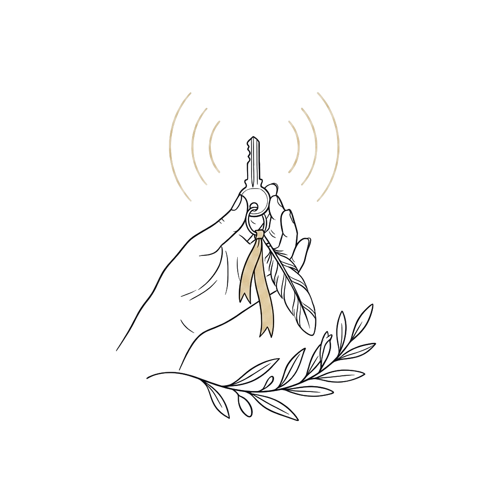
Pre-qualification
journey-pre-qual.png

Pre-approval
journey-pre-approval.png
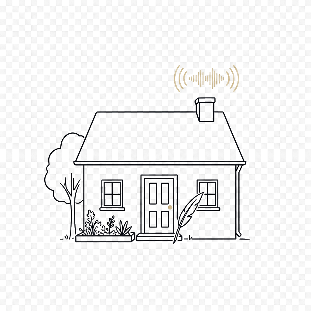
Loan application
journey-loan-app.png
Line work only (1.5pt strokes), two colors max (ink + gold), transparent PNG backgrounds. Generated via Gemini 3.1 Flash Image and post-processed with a luminance-mask alpha filter.
Components
Buttons, pills, cards
Primary CTA — ink on paper
Secondary text link
Trust pill
Kicker label
Almost there
Card
Section
Card surface
Hairline border, generous radius, paper background.
Don'ts
Anti-patterns
- ✗ Don't use stock photography. Ever.
- ✗ Don't add a robot/chatbot avatar — we are the quill, not a bot.
- ✗ Don't capitalize “voice to mortgage” mid-sentence — rewrite the sentence if needed.
- ✗ Don't write “v2m” lowercase — V2M is always caps.
- ✗ Don't use Helvetica, Comic Sans, or anything other than Inter as the body font.
- ✗ Don't put the quill mark inside a colored shape — it lives on the page background.
- ✗ Don't introduce new colors without updating the brand book first.
Brand book v1 · 2026-05-26 · Living document